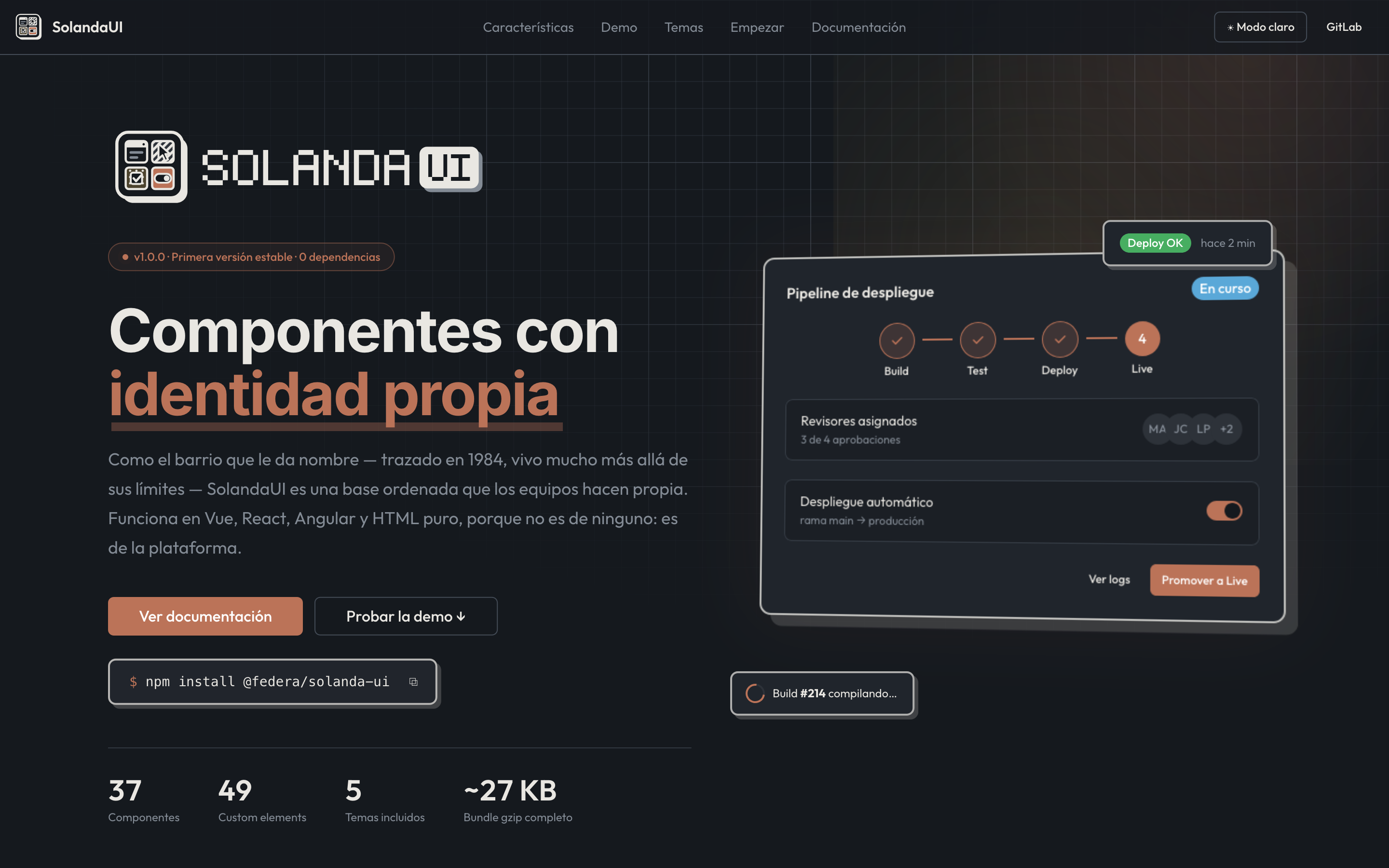
SolandaUI · Web Components UI Library
Framework-agnostic web components UI library with zero dependencies. 37 components, 49 custom elements, 6 themes, ~27 KB gzip. Works with Vue, React, Angular, and plain HTML — because it doesn't belong to any one framework: it belongs to the platform.
SolandaUI: Components with identity
Project overview
SolandaUI is a production-grade web components library (v1.0 stable) born from a conviction: interface components shouldn't depend on any specific framework. Named after the Quito neighborhood established in 1984 — alive far beyond its original boundaries — SolandaUI is a well-ordered foundation that each team makes its own. It works in Vue, React, Angular, and plain HTML, because it doesn't belong to any one framework: it belongs to the platform.
The library is built on Custom Elements v1 and Shadow DOM: the same component works in any stack without wrappers, adapters, or framework runtimes. Because it doesn't belong to any one framework: it belongs to the platform.
Why SolandaUI?
A clear plan that teams adopt, adapt, and take far beyond what the original design envisioned.
No framework lock-in
Write it once. Use it everywhere.
<!-- No setup required: import and use -->
<script type="module">
  import '@federa/solanda-ui/sl-button'
</script>
<sl-button variant="default" size="lg">Save changes</sl-button>
Lightweight
~27 KB gzip for the complete library. With tree-shaking, you pay only for what you use:
| Package | Size |
|---|---|
| SolandaUI complete | ~27 KB |
| Button + input + dialog only | ~6 KB |
| Typical UI kit + framework runtime | >100 KB |
6 Built-in themes
Five palettes with their own history, in light and dark, plus the neutral base:
- Solanda — Terracotta and Andean concrete (default theme)
- Social Neutral — Sober and neutral, for serious products
- Catppuccin — Soft pastel, beloved by the community
- Gruvbox — Warm retro from terminal inspiration
- Tokyo Night — Nocturnal neon high contrast
- Nord — Arctic, blue and serene
Accessibility
Native ARIA roles, focus traps in overlays, full keyboard navigation in every component. Keyboard first.
Design tokens
The entire system is controlled via CSS custom properties. Your brand enters as variables:
--sl-hsl-primary
--sl-radius-lg
--sl-spacing-4
--sl-shadow-md
--sl-font-family-base
Replace the tokens and the library adopts your brand without resistance.
Developer Experience
TypeScript + JSDoc
Full type definitions for every component and property. Autocomplete in your editor without any configuration.
custom-elements.json
Generated in every build so editors and tools understand the API.
llms.txt
Automatically generated file so AI assistants (Claude, Copilot, etc.) know the library with the same detail you do.
Installation
npm install @federa/solanda-ui
No setup steps. No polyfills. No dependencies.
Architecture
Custom Elements v1 + Shadow DOM
Every component is an encapsulated web component. No runtime, no Virtual DOM, no React. The browser understands it natively.
Tree-shakeable
Import only what you need:
import '@federa/solanda-ui/sl-button'
import '@federa/solanda-ui/sl-dialog'
import '@federa/solanda-ui/sl-input'
// ~6 KB total, not 27 KB
SSR Ready
Server-side rendering support. Components are inert until JS loads client-side, and hydration is automatic.
Project metrics
- 37 components (49 custom elements) covering forms, navigation, overlays, and layout
- 17 npm releases published
- 12 formal releases since inception (March 2026)
- 49 commits on the main repository
- License: AGPL-3.0
- Dependencies: 0 (only native browser Custom Elements + Shadow DOM)
Real-world use cases
What does this project demonstrate?
-
Platform-level component architecture: Building on standard Web Components means the code outlives framework obsolescence. You're not tied to React, Angular, or Vue's lifecycle.
-
Scalable design systems: Design tokens allow a single library to serve dozens of products with different brands, without forking or duplication.
-
Performance by design: ~27 KB gzip with everything included. Tree-shaking brings the real load to ~6 KB when only three components are needed.
Enterprise applications
- Corporate UI kit: One library for all of a company's products, with themes customized per product/brand.
- Shared components: Same API across web frontend, Nuxt SSR, and mobile webviews.
- Design systems as product: The library itself is the product — versioned, documented, with stable API contracts under semver.
FAQ
Does SolandaUI work with Vue, React, or Angular?
Yes. Custom Elements are native to the browser. You can use them directly in HTML, or wrap them in Vue (<sl-button>), React (React.createElement('sl-button')), or Angular (<sl-button> with standalone: true). No mandatory wrappers.
Why zero dependencies?
Because the browser already has everything you need: Custom Elements, Shadow DOM, CSS Custom Properties, ES Modules. Every external dependency adds bundle bytes and update cycles. SolandaUI trusts what the browser provides.
Is it accessible by default?
Yes. Every component implements ARIA roles, managed states, visible focus, and keyboard navigation. You don't need to manually add aria-* — the component handles it internally.
When would I use SolandaUI instead of Material Web or Shoelace?
SolandaUI includes customizable themes (6 palettes included), design tokens for corporate branding, llms.txt for AI assistants, and is designed as a base that each team adapts — not a catalogue that each team copies. The API is stable under semver (1.0).
What is the license?
AGPL-3.0. The code is free to use, modify, and distribute, including in commercial products. If you modify the library, modifications must be shared under the same license.
Roadmap
- More form and data components (tables, selectors, charts)
- Native integration with Svelte and Solid.js
- Support for Web Components in native environments (Electron, Tauri)
- Visual theme generator with web-based editor